Peak3 is an insurance service provider that integrates with partner platforms to offer insurance products directly within existing user flows. Rather than redirecting users to a separate insurance portal, Peak3 embeds its services natively into its partners' ecosystems.
During my internship, I was responsible for designing checkout and insurance interfaces across two of Peak3's partner platformsLazada and Yessscredit. Each platform had its own design language, user base, and technical constraints, requiring tailored solutions while maintaining a consistent insurance experience across both.
Insurance is inherently complex, and embedding it within someone else's platform makes it even harder. The core challenge was designing flows that felt native to each partner's product while clearly communicating insurance concepts that users typically find confusing or easy to skip.
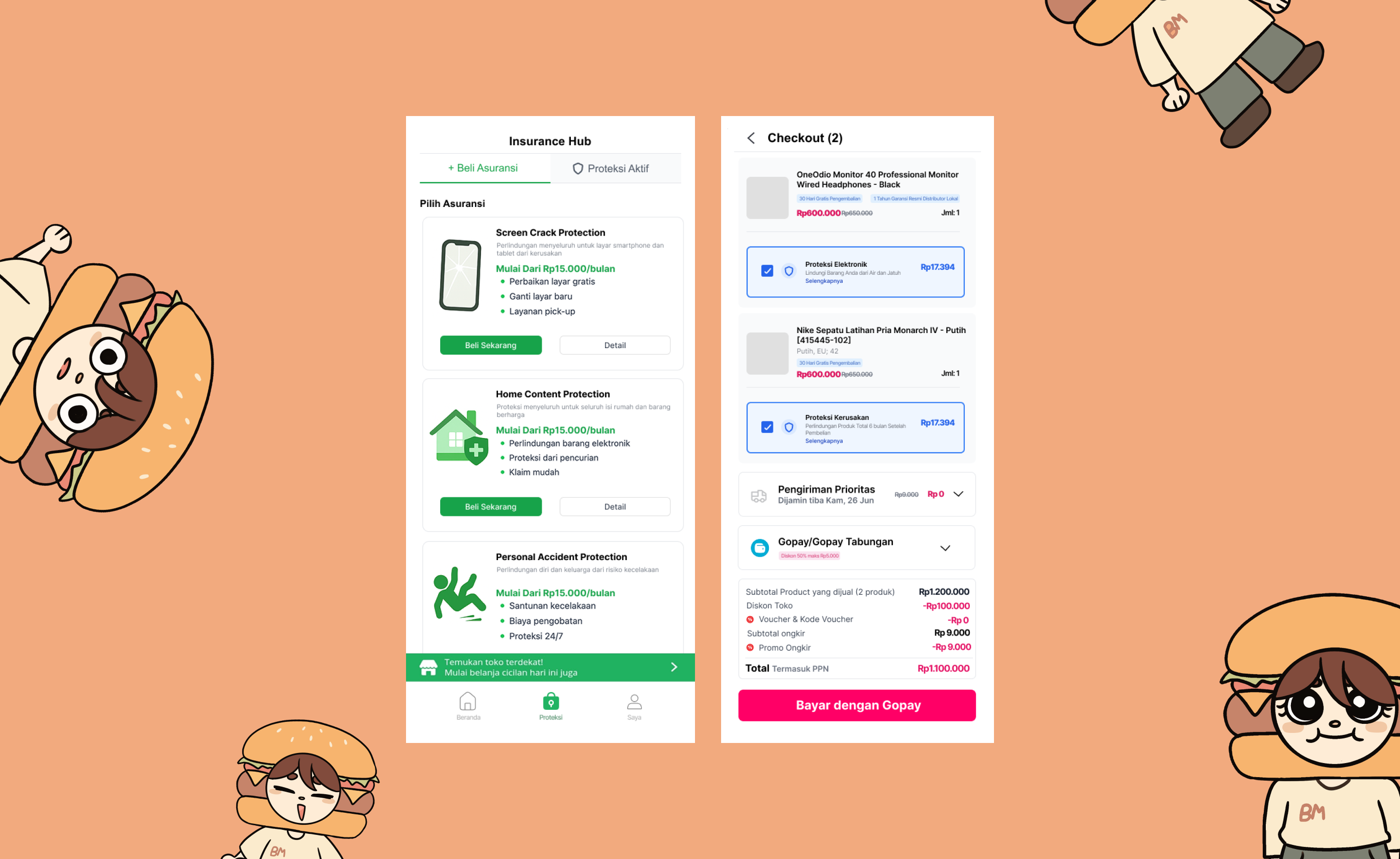
For Lazada, the insurance explanation needed to be simple enough that users understood the value proposition during a fast-paced e-commerce checkout. For Yessscredit, the scope was broader, spanning QR checkout, payment confirmation, insurance purchasing, and item loan management, all within a single cohesive mobile experience.
2
Partner Platforms
8
Screens Designed
The internship was fast-paced and compact, which meant there was little room for extended discovery phases. Instead, the process was built around rapid iteration and continuous feedback, designing, presenting, refining, and repeating in tight cycles.
Each round of feedback shaped the next version of the designs. This constant back-and-forth kept the work aligned with stakeholder expectations, but it also required adaptabilitybeing ready to pivot directions quickly when priorities shifted or new requirements emerged.
With a short internship window, every decision had to be intentional and defensible. There was no time for speculative explorationeach screen had to solve a specific problem, and each iteration had to move the design meaningfully forward.
Insurance Clarity:
Users tend to skip insurance options when the explanation is too dense. The Lazada flow uses a step-by-step visual breakdown to make the process feel approachable rather than overwhelming.
Checkout Trust:
The Yessscredit checkout flow needed to build confidence at every step, from QR scan to payment confirmation, ensuring users felt secure throughout the transaction.
Information Density:
The insurance hub and item loan screens had to surface detailed policy and product information without feeling cluttered on a mobile viewport.
Despite the compressed timeline, the project delivered complete, production-ready screens across both partner platforms. The designs successfully balanced each platform's visual identity with Peak3's insurance requirementscreating flows that felt integrated rather than bolted on.
This internship was a lesson in velocity without sacrificing quality. Working across two platforms simultaneously, with constant feedback loops and shifting priorities, taught me to make design decisions faster and defend them clearly. There was no room for indecisionevery iteration had to count.
It also reinforced the importance of designing for context. The same insurance product needed to feel completely different depending on whether it appeared in an e-commerce checkout or a fintech lending app. Understanding the user's mindset in each context was the key to making both integrations feel natural.
If I could do it again, I would push for more structured user testing even within the tight timeline. Quick guerrilla tests between iterations would have added confidence to the design decisions and caught usability issues earlier.
* Some screens and documentation cannot be shown due to privacy and confidentiality agreements.
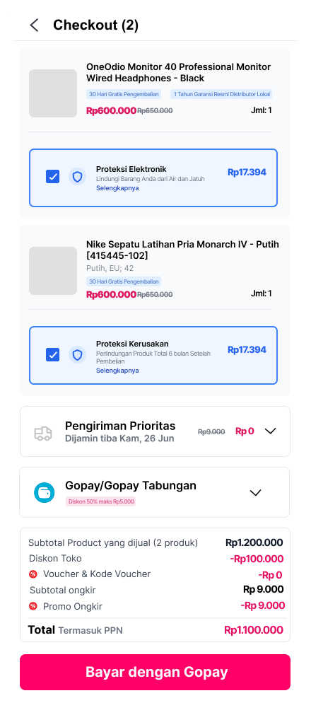
Insurance integration within Lazada's e-commerce checkout experience.
Checkout Page
The checkout flow with integrated insurance optionsdesigned to feel native to Lazada's existing purchase experience.
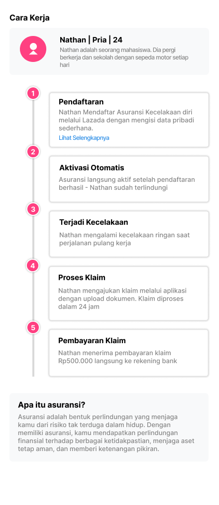
Insurance Explanation
A step-by-step visual breakdown of how the insurance worksfrom registration to claimsmaking a complex process feel simple and approachable.
Checkout, insurance, and loan management flows for a fintech lending platform.
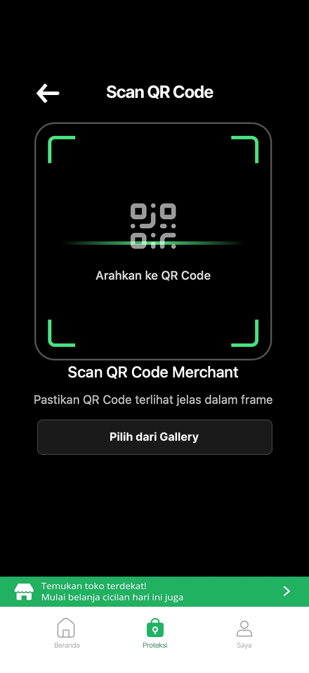
QR Checkout
QR code scannerthe entry point for initiating a purchase through the Yessscredit app.
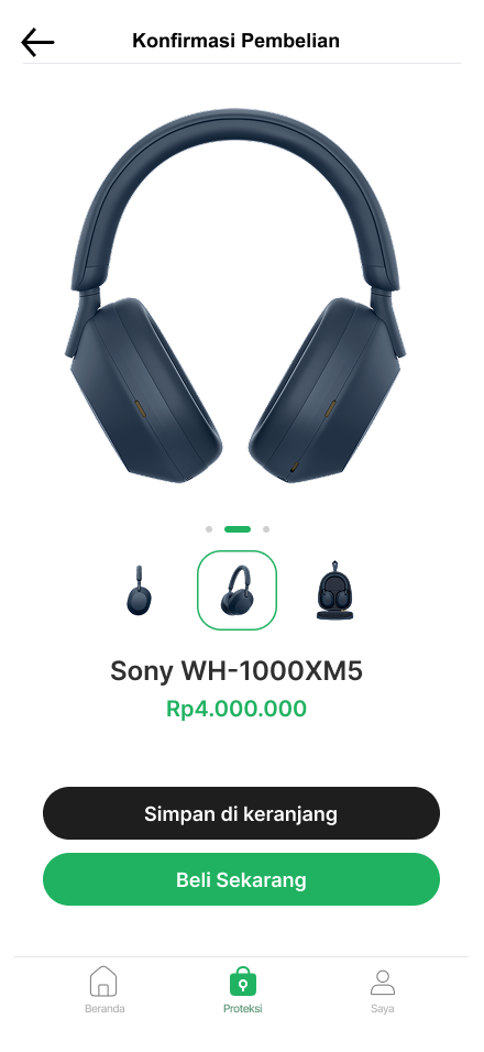
Product Confirmation
Product details and purchase optionsusers can save to cart or proceed to buy immediately.
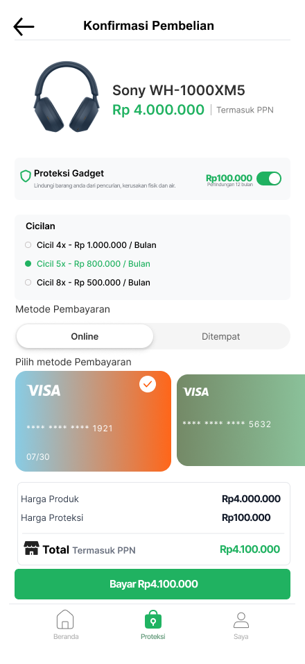
Payment Details
Final payment confirmation with instalment breakdown, insurance add-on, and total cost summary.
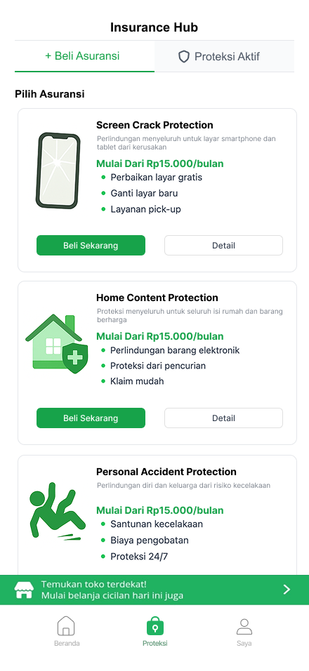
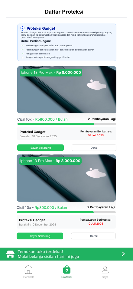
Insurance Hub
Browse available protection plansscreen crack, home content, and personal accident coverage.
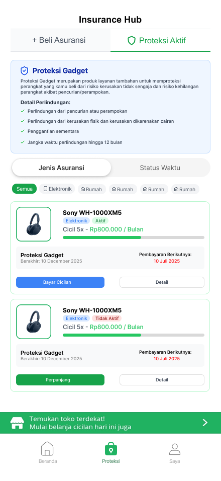
Current Insured Items
Overview of active insurance policiesusers can track coverage status and manage their protected items.
Item Loan List
Active loan items with protection statuslinking purchases, insurance, and repayment in one view.